Appearance
Focus ring
Focus rings are accessible outlines for components to show keyboard focus.
Focus rings follow the same heuristics as :focus-visible to determine when they are visible.
Usage
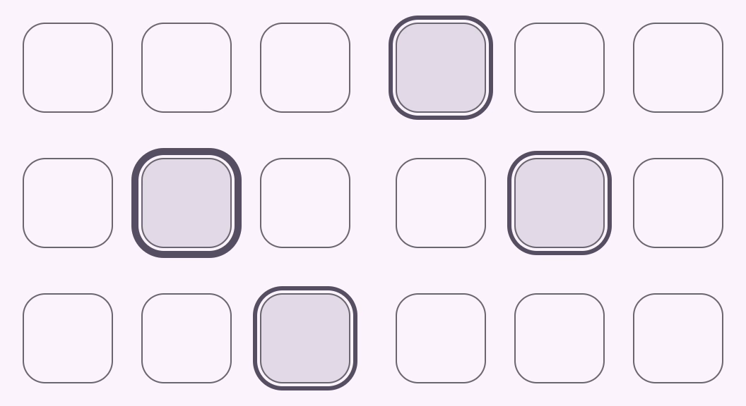
Focus rings display on keyboard navigation. They may be attached to a control in one of three ways.
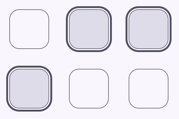
Attached to the parent element
html<button style="position: relative"> <md-focus-ring style="--md-focus-ring-shape: 8px"></md-focus-ring> </button>Attached to a referenced element
html<div style="position: relative"> <md-focus-ring for="control" style="--md-focus-ring-shape: 8px"></md-focus-ring> <input id="control"> </div>Attached imperatively
html<div style="position: relative"> <md-focus-ring id="ring" style="--md-focus-ring-shape: 8px"></md-focus-ring> <button id="ring-control"></button> </div> <script> const focusRing = document.querySelector('#ring'); const control = document.querySelector('#ring-control'); focusRing.attach(control); </script>
Note: focus rings must be placed within a
position: relativecontainer.
Inward
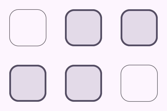
Focus rings can be changed to animate inwards by adding an inward attribute. This is useful for components like list items.
html
<button style="position: relative">
  <md-focus-ring inward style="--md-focus-ring-shape: 8px"></md-focus-ring>
</button>
Animation
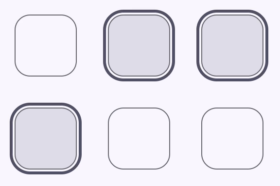
The focus ring animation may be customized or disabled using CSS custom properties.
html
<style>
  md-focus-ring {
    --md-focus-ring-duration: 0s; /* disabled animation */
  }
</style>
Accessibility
Focus rings are visual components and do not have assistive technology requirements.
Theming
Focus rings supports Material theming and can be customized in terms of color and shape.
Tokens
| Token | Default value |
|---|---|
--md-focus-ring-color | --md-sys-color-secondary |
--md-focus-ring-shape | --md-sys-shape-corner-full |
--md-focus-ring-width | 3px |
Example
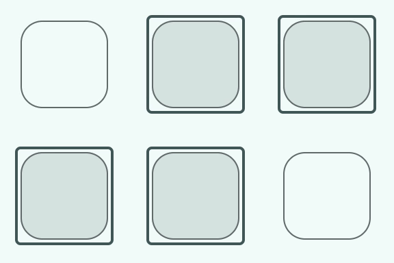
html
<style>
md-focus-ring {
  --md-focus-ring-shape: 0px;
  --md-focus-ring-width: 2px;
  --md-focus-ring-active-width: 4px;
  --md-sys-color-secondary: #4A6363;
}
</style>

<button>
  <md-focus-ring></md-focus-ring>
</button>
API
MdFocusRing <md-focus-ring>
Properties
| Property | Attribute | Type | Default | Description |
|---|---|---|---|---|
visible | visible | boolean | false | Makes the focus ring visible. |
inward | inward | boolean | false | Makes the focus ring animate inwards instead of outwards. |
htmlFor | string | undefined | ||
control | HTMLElement | undefined |
Methods
| Method | Parameters | Returns | Description |
|---|---|---|---|
attach | control | void | |
detach | None | void |
Events
| Event | Type | Bubbles | Composed | Description |
|---|---|---|---|---|
visibility-changed | Event | No | No | Fired whenever visible changes. |