Appearance
Bottom Navigation
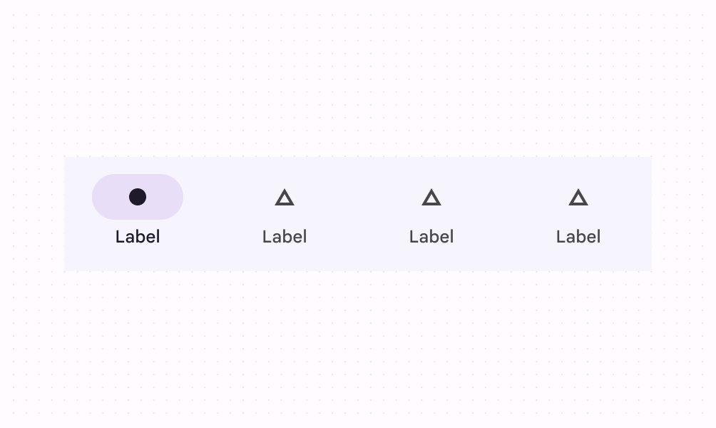
Bottom navigation bars allow movement between primary destinations in an app.
Contents
Design and API Documentation
Using bottom navigation
Before you can use the Material bottom navigation, you need to add a dependency to the Material Components for Android library. For more information, go to the Getting started page.
A typical layout looks like this:
xml
<LinearLayout
    xmlns:android="http://schemas.android.com/apk/res/android"
    xmlns:app="http://schemas.android.com/apk/res-auto"
    android:layout_width="match_parent"
    android:layout_height="wrap_content">
  ...
  <com.google.android.material.bottomnavigation.BottomNavigationView
      android:id="@+id/bottom_navigation"
      android:layout_width="match_parent"
      android:layout_height="wrap_content"
      app:menu="@menu/bottom_navigation_menu" />

</LinearLayout>
The @menu/bottom_navigation_menu resource should point to a file named bottom_navigation_menu.xml inside a menu resource directory:
xml
<menu xmlns:android="http://schemas.android.com/apk/res/android">
  <item
      android:id="@+id/item_1"
      android:enabled="true"
      android:icon="@drawable/icon_1"
      android:title="@string/text_label_1"/>
  <item
      android:id="@+id/item_2"
      android:enabled="true"
      android:icon="@drawable/icon_2"
      android:title="@string/text_label_2"/>
</menu>
Note: BottomNavigationView does not support more than 5 menu items.
In code:
kt
NavigationBarView.OnItemSelectedListener { item ->
    when(item.itemId) {
        R.id.item_1 -> {
            // Respond to navigation item 1 click
            true
        }
        R.id.item_2 -> {
            // Respond to navigation item 2 click
            true
        }
        else -> false
    }
}
There's also a method for detecting when navigation items have been reselected:
kt
bottomNavigation.setOnItemReselectedListener { item ->
    when(item.itemId) {
        R.id.item_1 -> {
            // Respond to navigation item 1 reselection
        }
        R.id.item_2 -> {
            // Respond to navigation item 2 reselection
        }
    }
}
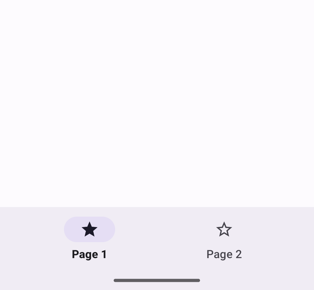
That results in:
Note: We have deprecated the BottomNavigationView#setOnNavigationItemSelectedListener and BottomNavigationView#setOnNavigationItemReselectedListener methods in favor of the listeners in NavigationBarView. This allows you to share selection handling code between the BottomNavigation and NavigationRail view elements.
Making bottom navigation accessible
You should set an android:title for each of your menu items so that screen readers like TalkBack can properly announce what each navigation item represents:
xml
<menu xmlns:android="http://schemas.android.com/apk/res/android">
  <item
      ...
      android:title="@string/text_label"/>
  ...
</menu>
The labelVisibilityMode attribute can be used to adjust the behavior of the text labels for each navigation item. There are four visibility modes:
LABEL_VISIBILITY_AUTO(default): The label behaves as “labeled” when there are 3 items or less, or “selected” when there are 4 items or moreLABEL_VISIBILITY_SELECTED: The label is only shown on the selected navigation itemLABEL_VISIBILITY_LABELED: The label is shown on all navigation itemsLABEL_VISIBILITY_UNLABELED: The label is hidden for all navigation items
Adding badges

Initialize and show a BadgeDrawable associated with menuItemId, subsequent calls to this method will reuse the existing BadgeDrawable:
kt
var badge = bottomNavigation.getOrCreateBadge(menuItemId)
badge.isVisible = true
// An icon only badge will be displayed unless a number or text is set:
badge.number = 99  // or badge.text = "New"
As a best practice, if you need to temporarily hide the badge, for instance until the next notification is received, change the visibility of BadgeDrawable:
kt
val badgeDrawable = bottomNavigation.getBadge(menuItemId)
    if (badgeDrawable != null) {
        badgeDrawable.isVisible = false
        badgeDrawable.clearNumber()  // or badgeDrawable.clearText()
    }
To remove any BadgeDrawables that are no longer needed:
kt
bottomNavigation.removeBadge(menuItemId)See the BadgeDrawable documentation for more information about badges.
Bottom navigation bar
Bottom navigation bar example
API and source code:
BottomNavigationView
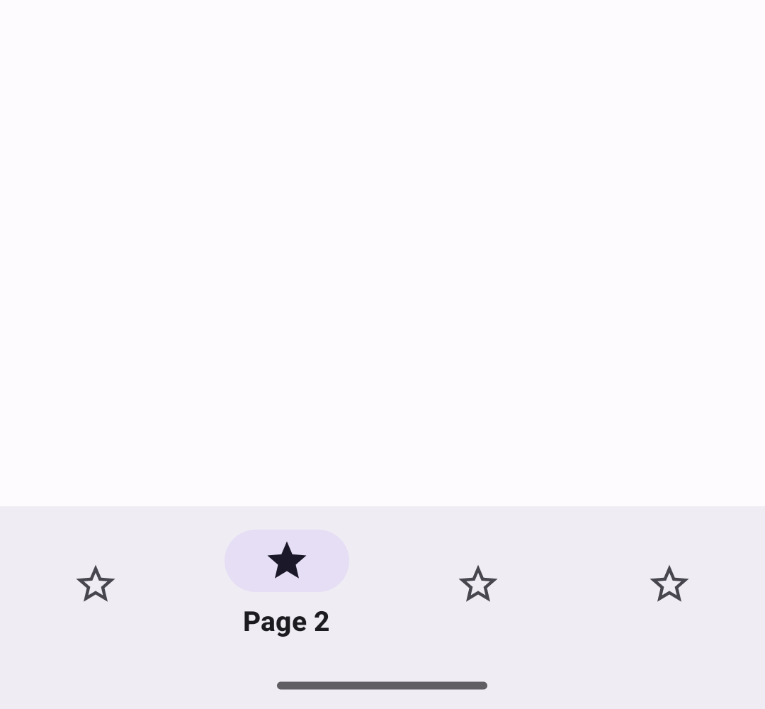
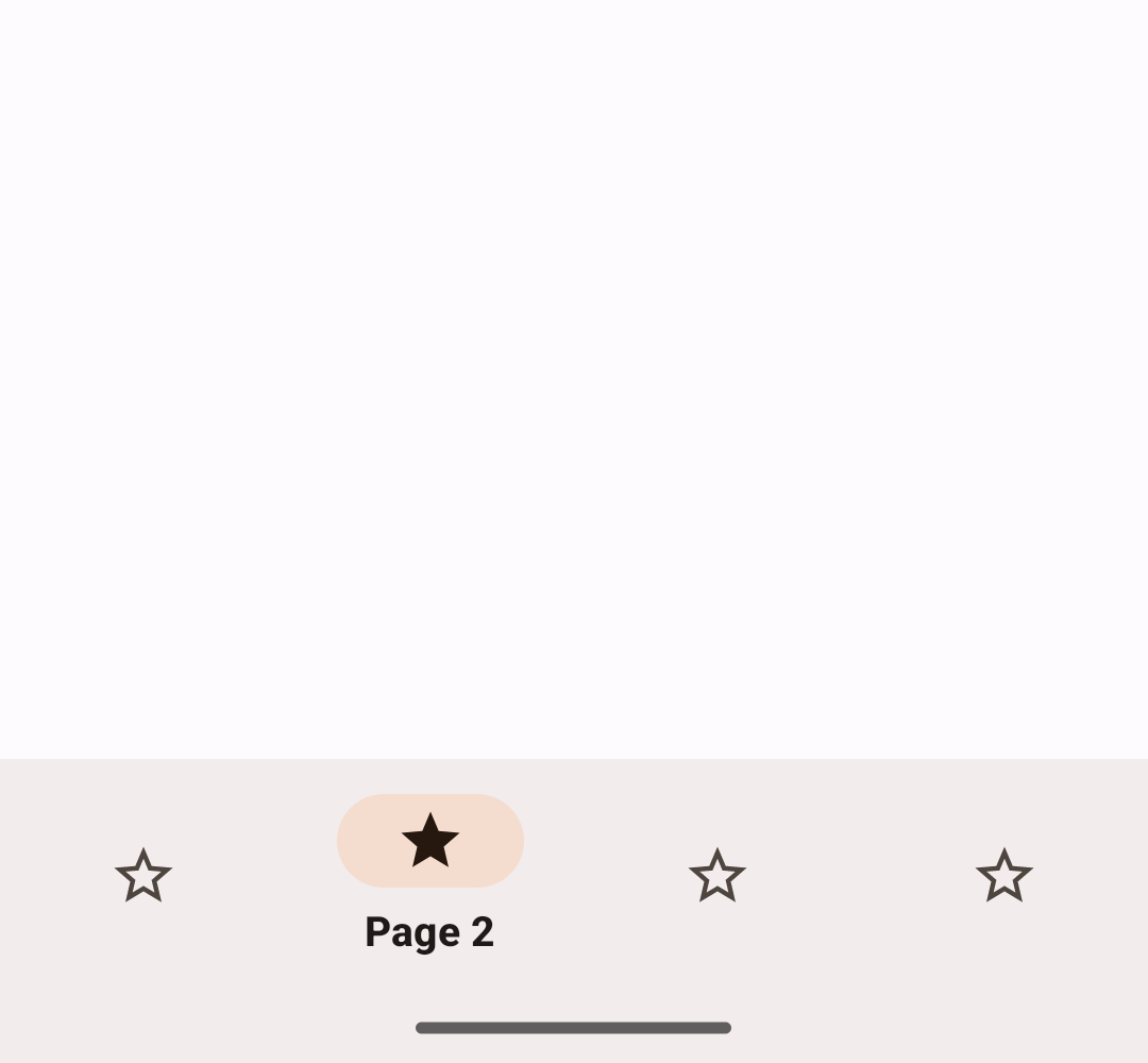
The following example shows a bottom navigation bar with four icons:
In layout.xml:
xml
<LinearLayout
    xmlns:android="http://schemas.android.com/apk/res/android"
    xmlns:app="http://schemas.android.com/apk/res-auto"
    android:layout_width="match_parent"
    android:layout_height="wrap_content">

  <com.google.android.material.bottomnavigation.BottomNavigationView
      android:id="@+id/bottom_navigation"
      android:layout_width="match_parent"
      android:layout_height="wrap_content"
      app:menu="@menu/bottom_navigation_menu" />

</LinearLayout>
In bottom_navigation_menu.xml inside a menu resource directory:
xml
<menu xmlns:android="http://schemas.android.com/apk/res/android">
  <item
      android:id="@+id/page_1"
      android:enabled="true"
      android:icon="@drawable/ic_star"
      android:title="@string/page_1"/>
  <item
      android:id="@+id/page_2"
      android:enabled="true"
      android:icon="@drawable/ic_star"
      android:title="@string/page_2"/>
  <item
      android:id="@+id/page_3"
      android:enabled="true"
      android:icon="@drawable/ic_star"
      android:title="@string/page_3"/>
  <item
      android:id="@+id/page_4"
      android:enabled="true"
      android:icon="@drawable/ic_star"
      android:title="@string/page_4"/>
</menu>
In code:
kt
bottomNavigation.selectedItemId = R.id.page_2Anatomy and key properties
The following is an anatomy diagram for the bottom navigation bar:
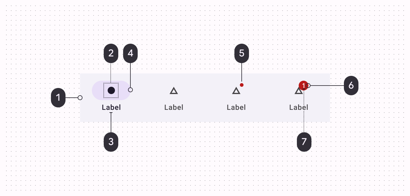
- (1) Container
- (2) Icon
- (3) Label text
- (4) Active indicator
- (5) Small badge (optional)
- (6) Large badge (optional)
- (7) Large badge number
Container attributes
| Element | Attribute | Related methods | Default value |
|---|---|---|---|
| Color | app:backgroundTint | N/A | ?attr/colorSurfaceContainer |
| Elevation | app:elevation | setElevation | 3dp |
| Compat Shadow (deprecated) | compatShadowEnabled | N/A | false |
Note: compatShadowEnabled has no effect, as the library no longer supports pre-Lollipop.
Navigation item attributes
| Element | Attribute | Related methods | Default value |
|---|---|---|---|
| Menu resource | app:menu | inflateMenugetMenu | N/A |
| Ripple (inactive) | app:itemRippleColor | setItemRippleColorgetItemRippleColor | Variations of ?attr/colorPrimary and ?attr/colorOnSurfaceVariant (see all states) |
| Ripple (active) | " | " | Variations of ?attr/colorPrimary (see all states) |
| Label visibility mode | app:labelVisibilityMode | setLabelVisibilityModegetLabelVisibilityMode | LABEL_VISIBILITY_AUTO |
| Item Gravity | app:itemGravity | setItemGravitygetItemGravity | TOP_CENTER |
Active indicator attributes
| Element | Attribute | Related methods | Default value |
|---|---|---|---|
| Color | android:color | setItemActiveIndicatorColorgetItemActiveIndicatorColor | ?attr/colorSecondaryContainer |
| Width | android:width | setItemActiveIndicatorWidthgetItemActiveIndicatorWidth | 56dp |
| Height | android:height | setItemActiveIndicatorHeightgetItemActiveIndicatorHeight | 32dp |
| Shape | app:shapeAppearance | setItemActiveIndicatorShapeAppearancegetItemActiveIndicatorShapeAppearance | 50% rounded |
| Margin horizontal | app:marginHorizontal | setItemActiveIndicatorMarginHorizontalgetItemActiveIndicatorMarginHorizontal | 4dp |
| Padding between indicator and label | app:activeIndicatorLabelPadding | setActiveIndicatorLabelPadding getActiveIndicatorLabelPadding | 4dp |
| Expanded Width | expandedWidth | setItemExpandedActiveIndicatorWidthgetItemExpandedActiveIndicatorWidth | HUG |
| Expanded Height | expandedHeight | setItemExpandedActiveIndicatorHeightgetItemExpandedActiveIndicatorHeight | 56dp |
| Expanded Margin horizontal | app:expandedMarginHorizontal | setItemExpandedActiveIndicatorMarginHorizontalgetItemExpandedActiveIndicatorMarginHorizontal | 20dp |
Note: The expanded active indicator refers to the active indicator that expands to wrap the content of the Bottom Navigation item when the itemIconGravity value is equal to START.
Icon attributes
| Element | Attribute | Related methods | Default value |
|---|---|---|---|
| Icon | android:icon in the menu resource | N/A | N/A |
| Size | app:itemIconSize | setItemIconSizesetItemIconSizeResgetItemIconSize | 24dp |
| Color (inactive) | app:itemIconTint | setItemIconTintListgetItemIconTintList | ?attr/colorOnSurfaceVariant (see all states) |
| Color (active) | " | " | ?attr/colorOnSecondaryContainer (see all states) |
| Gravity | app:itemIconGravity | setItemIconGravitygetItemIconGravity | TOP |
Text label attributes
| Element | Attribute | Related methods | Default value |
|---|---|---|---|
| Text label | android:title in the menu resource | N/A | N/A |
| Color (inactive) | app:itemTextColor | setItemTextColorgetItemTextColor | ?attr/colorOnSurfaceVariant (see all states) |
| Color (active) | " | " | ?attr/colorOnSurface (see all states) |
| Typography (inactive) | app:itemTextAppearanceInactiveapp:horizontalItemTextAppearanceInactive | setItemTextAppearanceInactivegetItemTextAppearanceInactivesetHorizontalItemTextAppearanceInactivegetHorizontalItemTextAppearanceInactive | ?attr/textAppearanceTitleSmall |
| Typography (active) | app:itemTextAppearanceActiveapp:horizontalItemTextAppearanceActive | setItemTextAppearanceActivegetItemTextAppearanceActivesetHorizontalItemTextAppearanceActivegetHorizontalItemTextAppearanceActive | ?attr/textAppearanceTitleSmall |
| Typography (active) | app:itemTextAppearanceActiveBoldEnabled | setItemTextAppearanceActiveBoldEnabled | true |
Styles
| Element | Style | Container color | Icon/Text label color (inactive) | Icon/Text label color (active) |
|---|---|---|---|---|
| Default style | Widget.Material3.BottomNavigationView | ?attr/colorSurface | ?attr/colorOnSurfaceVariant | Icon: ?attr/colorOnSecondaryContainer Text: ?attr/colorOnSurface |
Default style theme attribute: ?attr/bottomNavigationStyle
See the full list of styles, navigation bar attributes, and bottom navigation attributes.
Theming a bottom navigation bar
Bottom navigation supports Material Theming, which can customize color and typography.
Bottom navigation theming example
API and source code:
BottomNavigationView
The following example shows a bottom navigation bar with Material Theming.
Implementing bottom navigation theming
Use theme attributes and a style in res/values/styles.xml, which applies to all bottom navigation bars and affects other components:
xml
<style name="Theme.App" parent="Theme.Material3.*">
    ...
    <item name="colorSurface">@color/shrine_theme_light_surface</item>
    <item name="colorOnSurfaceVariant">@color/shrine_theme_light_onSurfaceVariant</item>
</style>
Use a default style theme attribute, styles, and a theme overlay, which apply to all bottom navigation bars but do not affect other components:
xml
<style name="Theme.App" parent="Theme.Material3.*">
    ...
    <item name="bottomNavigationStyle">@style/Widget.App.BottomNavigationView</item>
</style>

<style name="Widget.App.BottomNavigationView" parent="Widget.Material3.BottomNavigationView">
    <item name="materialThemeOverlay">@style/ThemeOverlay.App.BottomNavigationView</item>
</style>

<style name="ThemeOverlay.App.BottomNavigationView" parent="">
    <item name="colorSurface">@color/shrine_theme_light_surface</item>
    <item name="colorOnSurfaceVariant">@color/shrine_theme_light_onSurfaceVariant</item>
</style>
Use the style in the layout, which affects only this specific bottom navigation bar:
xml
<com.google.android.material.bottomnavigation.BottomNavigationView
    ...
    style="@style/Widget.App.BottomNavigationView"
/>