Appearance
Time pickers
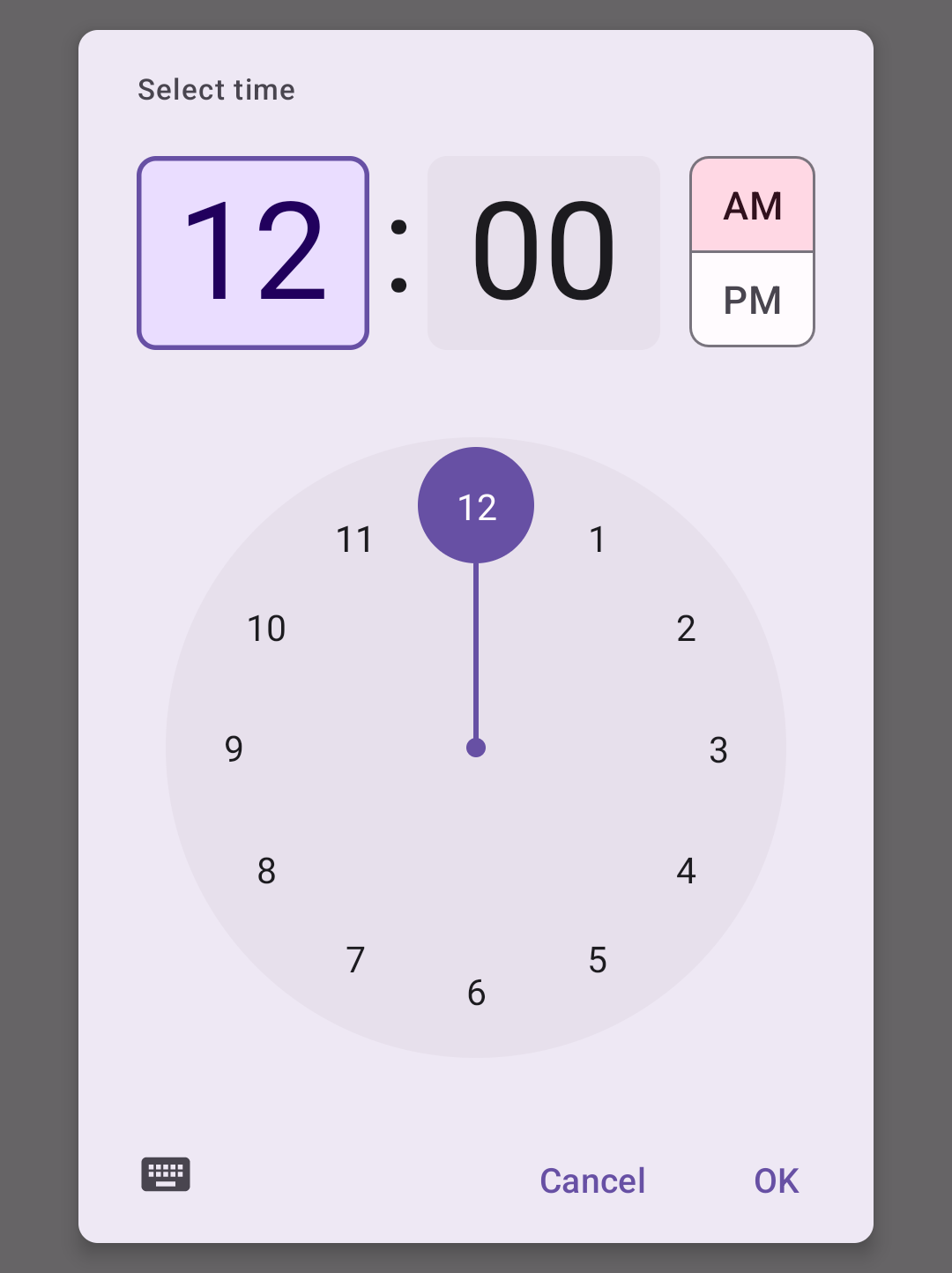
Time pickers help users select and set a specific time.
Contents
Design and API Documentation
Using time pickers
Before you can use Material time pickers, you need to add a dependency to the Material Components for Android library. For more information, go to the Getting started page.
Usage
API and source code:
MaterialTimePicker
A time picker can be instantiated with MaterialTimePicker.Builder
kt
val picker =
    MaterialTimePicker.Builder()
        .setTimeFormat(TimeFormat.CLOCK_12H)
        .setHour(12)
        .setMinute(10)
        .setTitleText("Select Appointment time")
        .build()
minute is a [0, 60) value and hour is a [0, 23] value regardless of which time format you choose.
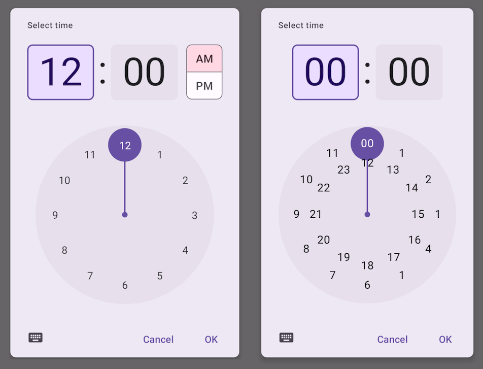
You can use either TimeFormat.CLOCK_12H (1 ring) or TimeFormat.CLOCK_24H (2 rings), depending on the location of the device:
kt
val isSystem24Hour = is24HourFormat(this)
val clockFormat = if (isSystem24Hour) TimeFormat.CLOCK_24H else TimeFormat.CLOCK_12H
The time picker's input mode defaults to clock mode (INPUT_MODE_CLOCK) with TimeFormat.CLOCK_12H and text input mode (INPUT_MODE_KEYBOARD) with TimeFormat.CLOCK_24H.
The time picker can be started in clock mode with:
kt
MaterialTimePicker.Builder().setInputMode(INPUT_MODE_CLOCK)The time picker can be started in text input mode with:
kt
MaterialTimePicker.Builder().setInputMode(INPUT_MODE_KEYBOARD)To show the time picker to the user:
kt
picker.show(fragmentManager, "tag");Subscribe to positive button click, negative button click, cancel and dismiss events with the following calls:
kt
picker.addOnPositiveButtonClickListener {
    // call back code
}
picker.addOnNegativeButtonClickListener {
   // call back code
}
picker.addOnCancelListener {
    // call back code
}
picker.addOnDismissListener {
    // call back code
}
You can get the user selection with picker.minute and picker.hour.
Making time pickers accessible
Material time pickers are fully accessible and compatible with screen readers. The title of your time picker will be read when the user launches the dialog. Use a descriptive title that for the task:
kt
val picker =
   MaterialTimePicker.Builder()
       .setTitleText("Select Appointment time")
   ...
Anatomy and key properties
A Time Picker has a title, an input method, a clock dial, an icon to switch input and an AM/PM selector.
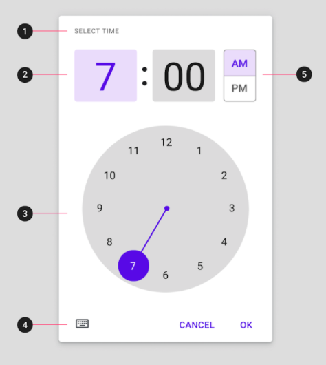
- Title
- Interactive display and time input for hour and minutes
- Clock dial
- Icon button to switch to time input
- AM/PM selector
Attributes
| Element | Attribute | Related method(s) | Default value |
|---|---|---|---|
| Hour | N/A | Builder.setHourMaterialTimePicker.getHour | 0 |
| Minute | N/A | Builder.setMinuteMaterialTimePicker.getMinute | 0 |
| Title | N/A | Builder.setTitleText | Select Time |
| Keyboard Icon | app:keyboardIcon | N/A | @drawable/ic_keyboard_black_24dp |
| Clock Icon | app:clockIcon | N/A | @drawable/ic_clock_black_24dp |
| Clock face Background Color | app:clockFaceBackgroundColor | N/A | ?attr/colorSurfaceContainerHighest |
| Clock hand color | app:clockNumberTextColor | N/A | ?attr/colorPrimary |
| Clock Number Text Color | app:clockNumberTextColor | N/A | ?attr/colorOnBackground |
Styles
| Element | Style |
|---|---|
| Default style | Widget.Material3.MaterialTimePicker |
Default style theme attribute: ?attr/materialTimePickerStyle
The style attributes are assigned to the following components:
| Element | Affected component | Default |
|---|---|---|
| chipStyle | Number inputs in the clock mode | @style/Widget.Material3.MaterialTimePicker.Display |
| materialButtonOutlinedStyle | AM/PM toggle | @style/Widget.Material3.MaterialTimePicker.Button |
| imageButtonStyle | Keyboard/Text Input button | @style/Widget.Material3.MaterialTimePicker.ImageButton |
| materialClockStyle | Clock Face of the Time Picker | @style/Widget.Material3.MaterialTimePicker.Clock |
See the full list of styles and attributes.
Theming time pickers
Time Pickers support Material Theming which can customize color and typography.
Time picker theming example
The following example shows a Time Picker with Material Theming.
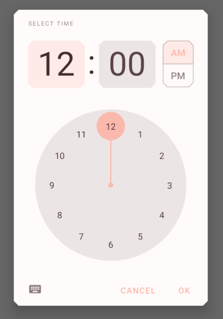
Use theme attributes and styles in res/values/styles.xml, which styles all time pickers and affects other components:
xml
<style name="Theme.App" parent="Theme.Material3.*">
    ...
    <item name="colorPrimary">@color/shrine_pink_100</item>
    <item name="colorOnPrimary">@color/shrine_pink_900</item>
    <item name="colorOnSurface">@color/shrine_pink_100</item>
    <item name="chipStyle">@style/Widget.App.Chip</item>
</style>
xml
<style name="Widget.App.Chip" parent="Widget.Material3.MaterialTimePicker.Display">
  <item name="android:textColor">@color/shrine_diplay_text_color</item>
</style>
In res/color/shrine_diplay_text_color.xml:
xml
<selector xmlns:android="http://schemas.android.com/apk/res/android">

  <item android:color="?attr/colorOnSecondary" android:state_enabled="true" android:state_selected="true"/>
  <item android:color="?attr/colorOnSecondary" android:state_enabled="true" android:state_checked="true"/>
  <item android:alpha="0.87" android:color="?attr/colorOnSurface" android:state_enabled="true"/>
  <item android:alpha="0.33" android:color="?attr/colorOnSurface"/>

</selector>
xml
<style name="Widget.App.TimePicker.Clock" parent="Widget.Material3.MaterialTimePicker.Clock">
    <item name="clockFaceBackgroundColor">@color/...</item>
    <item name="clockHandColor">@color/...</item>
    <item name="clockNumberTextColor">@color/...</item>
</style>
You can also set a theme specific to the time picker
xml
<style name="Theme.App" parent="Theme.Material3.*">
    ...
    <item name="materialTimePickerTheme">@style/ThemeOverlay.App.TimePicker</item>
</style>