Appearance
Dialogs
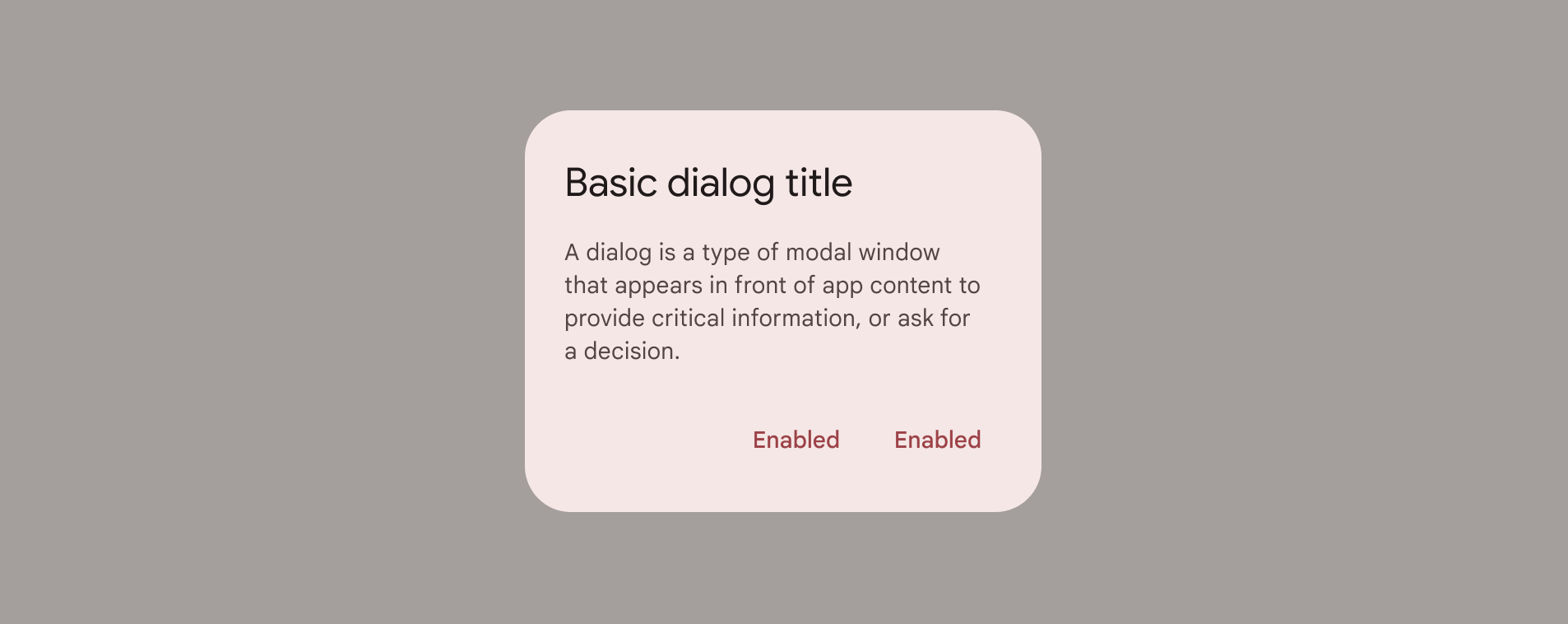
Dialogs inform users about a task and can contain critical information, require decisions, or involve multiple tasks.
Contents
Design and API Documentation
Using dialogs
Before you can use Material dialogs, you need to add a dependency to the Material Components for Android library. For more information, go to the Getting started page.
kt
MaterialAlertDialogBuilder(context)
    // Add customization options here
    .show()
Making dialogs accessible
The contents within a dialog should follow their own accessibility guidelines, such as an icon on a title having a content description via the android:contentDescription attribute set in the MaterialAlertDialog.Material3.Title.Icon style or descendant.
Types
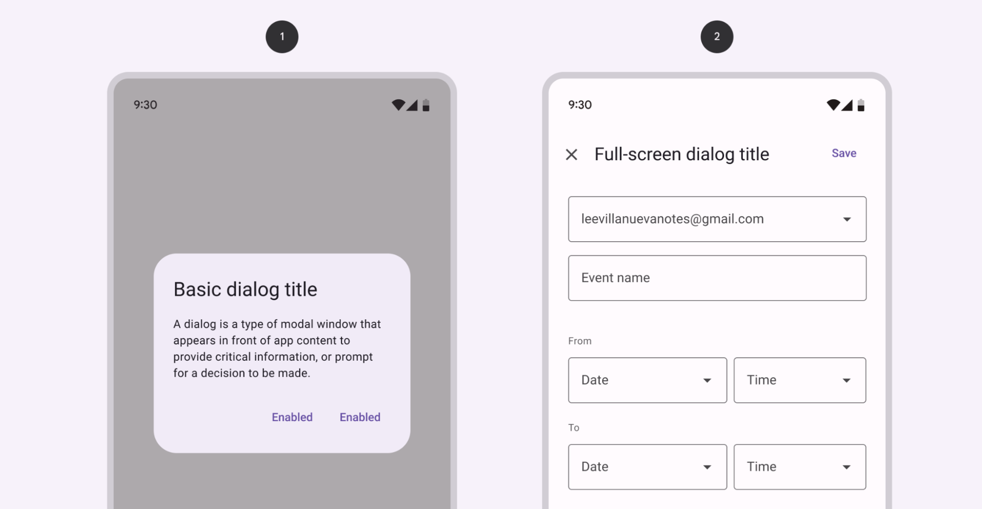
There are two types of dialogs: 1. Basic dialog, 2. Full-screen dialog
Dialogs
A dialog is a type of modal window that appears in front of app content to provide critical information or ask for a decision. Dialogs disable all app functionality when they appear, and remain on screen until confirmed, dismissed, or a required action has been taken.
Dialogs are purposefully interruptive, so they should be used sparingly.
Dialog examples
API and source code:
MaterialAlertDialogBuilder
Basic dialog
The following example shows a basic dialog.
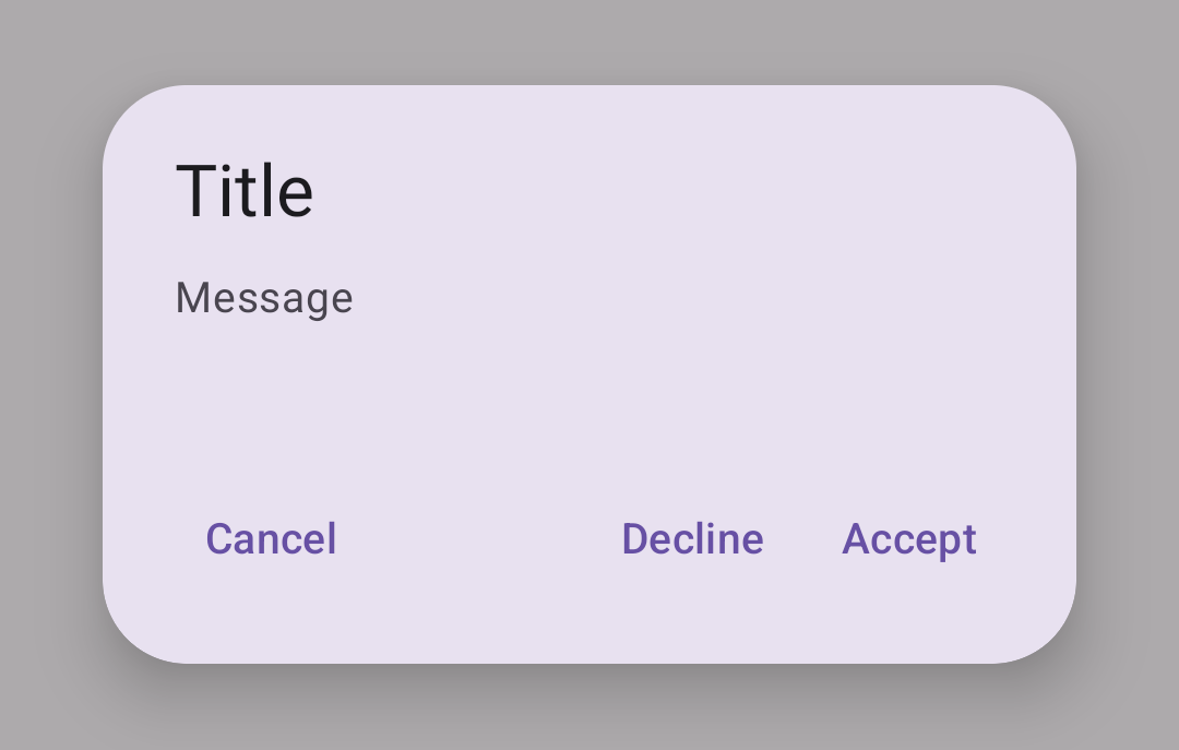
In code:
kt
MaterialAlertDialogBuilder(context)
        .setTitle(resources.getString(R.string.title))
        .setMessage(resources.getString(R.string.supporting_text))
        .setNeutralButton(resources.getString(R.string.cancel)) { dialog, which ->
            // Respond to neutral button press
        }
        .setNegativeButton(resources.getString(R.string.decline)) { dialog, which ->
            // Respond to negative button press
        }
        .setPositiveButton(resources.getString(R.string.accept)) { dialog, which ->
            // Respond to positive button press
        }
        .show()
Full-screen dialog
Full-screen dialogs group a series of tasks, such as creating a calendar entry with the event title, date, location, and time. Because they take up the entire screen, full-screen dialogs are the only dialogs over which other dialogs can appear.
There is no specific Material implementation of a full-screen dialog. You can implement it by using a DialogFragment as explained in the Android Developer guides.
Anatomy and key properties
A dialog has a container, content (either supporting text or a set of items of a particular type), a background scrim, and, optionally, title and buttons.
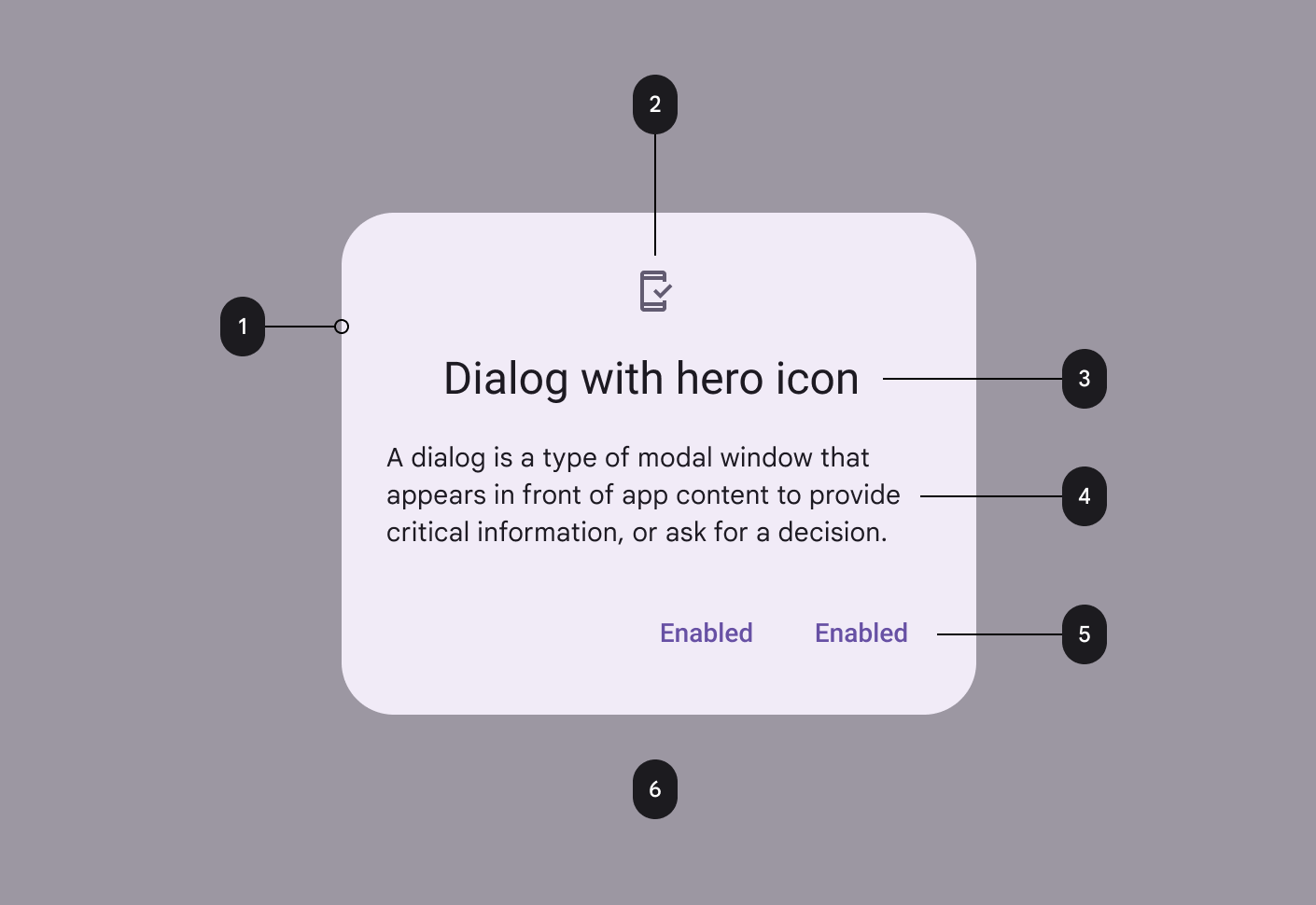
- Container
- Icon (optional)
- Title (optional)
- Content
- Buttons (optional)
- Scrim
Container attributes
| Element | Attribute | Related methods | Default value |
|---|---|---|---|
| Color | app:backgroundTint | N/A | ?attr/colorSurfaceContainerHigh |
| Shape | app:shapeAppearanceapp:shapeAppearanceOverlay | N/A | ?attr/shapeAppearanceCornerExtraLarge |
| Background inset start and end | app:backgroundInsetStartapp:backgroundInsetEnd | setBackgroundInsetStartsetBackgroundInsetEnd | 24dp |
| Background inset top and bottom | app:backgroundInsetTopapp:backgroundInsetBottom | setBackgroundInsetTopsetBackgroundInsetBottom | 80dp |
Title attributes
| Element | Attribute | Related methods | Default value |
|---|---|---|---|
| Text label | N/A | setTitlesetCustomTitle | null |
| Text color | android:textColor | N/A | ?attr/colorOnSurface |
| Typography | android:textAppearance | N/A | ?attr/textAppearanceHeadlineSmall |
| Icon | N/A | setIconsetIconAttribute | null |
| Icon tint | app:tint | N/A | ?attr/colorSecondary |
Content attributes
Supporting text
| Element | Attribute | Related methods | Default value |
|---|---|---|---|
| Text | N/A | setMessage | null |
| Color | android:textColor | N/A | ?attr/colorOnSurfaceVariant |
| Typography | android:textAppearance | N/A | ?attr/textAppearanceBodyMedium |
List item
| Element | Attribute | Related methods | Default value |
|---|---|---|---|
| List item layout | app:listItemLayout | setItems | @layout/mtrl_alert_select_dialog_item |
| List item layout style | N/A | N/A | ?attr/materialAlertDialogBodyTextStyle |
| List item text color | android:textColor | N/A | ?attr/colorOnSurfaceVariant |
| List item typography | android:textAppearance | N/A | ?attr/textAppearanceBodyMedium |
| Multi choice item layout | app:multiChoiceItemLayout | setMultiChoiceItems | @layout/mtrl_alert_select_dialog_multichoice |
| Single choice item layout | app:singleChoiceItemLayout | setSingleChoiceItems | @layout/mtrl_alert_select_dialog_singlechoice |
| Multi/single choice item style | android:checkedTextViewStyle | N/A | @style/Widget.Material3.CheckedTextView |
| Multi/single choice item text color | android:textColor | N/A | ?attr/colorOnSurfaceVariant |
| Multi/single choice item typography | android:textAppearance | N/A | ?attr/textAppearanceBodyLarge |
Note: You can set any custom view to be the content of your dialog via the setView method.
Buttons attributes
| Element | Attribute | Related methods | Default value |
|---|---|---|---|
| Buttons theme attributes (negative/positive) | app:buttonBar*ButtonStyle | N/A | @style/Widget.Material3.Button.TextButton.Dialog |
| Buttons theme attributes (neutral) | app:buttonBarNeutralButtonStyle | N/A | @style/Widget.Material3.Button.TextButton.Dialog.Flush |
| Buttons (neutral/negative/positive) | N/A | set*Button | null |
| Icons | N/A | set*ButtonIcon | null |
For specific button attributes, see the Buttons documentation.
Scrim attributes
| Element | Attribute | Related methods | Default value |
|---|---|---|---|
| Dim amount | android:backgroundDimAmount | N/A | 32% |
Theme overlays
| Element | Theme overlay | Description |
|---|---|---|
| Default theme overlay | ThemeOverlay.Material3.MaterialAlertDialog | Dialogs have start-aligned icons and titles with end-aligned buttons |
| Centered theme overlay | ThemeOverlay.Material3.MaterialAlertDialog.Centered | Dialogs have center-aligned icons and titles with end-aligned buttons |
Default theme overlay attribute: ?attr/materialAlertDialogTheme
Theme attributes
| Element | Theme attribute | Default value |
|---|---|---|
| Default style | ?attr/alertDialogStyle | @style/MaterialAlertDialog.Material3 |
| Title text style | ?attr/materialAlertDialogTitleTextStyle | @style/MaterialAlertDialog.Material3.Title.Text |
| Supporting text style | ?attr/materialAlertDialogBodyTextStyle | @style/MaterialAlertDialog.Material3.Body.Text |
See full list of styles, attributes, and theme overlays.
Theming dialogs
A dialog supports Material Theming which can customize color, typography and shape.
Dialog theming example
API and source code:
MaterialAlertDialogBuilder
The following example shows a dialog with Material Theming.
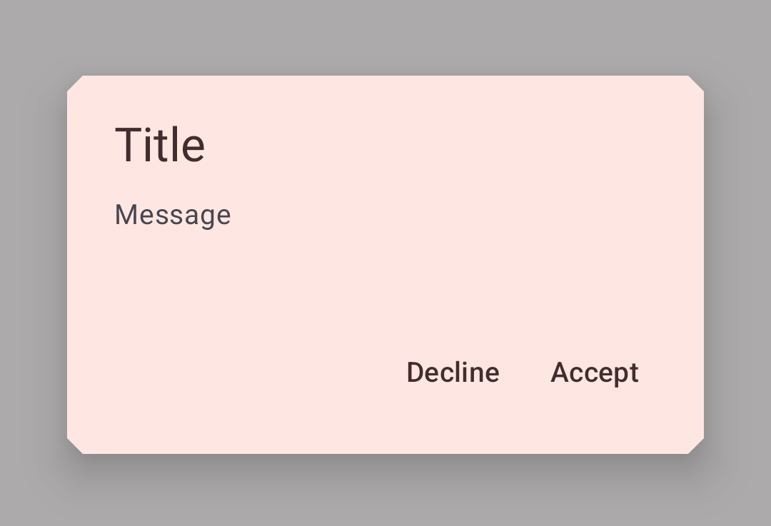
Implementing dialog theming
Setting the theme attribute materialAlertDialogTheme to your custom ThemeOverlay will affect all dialogs.
In res/values/themes.xml:
xml
<style name="Theme.App" parent="Theme.Material3.*">
  ...
  <item name="materialAlertDialogTheme">@style/ThemeOverlay.App.MaterialAlertDialog</item>
</style>

<style name="ThemeOverlay.App.MaterialAlertDialog" parent="ThemeOverlay.Material3.MaterialAlertDialog">
    <item name="colorPrimary">@color/shrine_pink_100</item>
    <item name="colorSecondary">@color/shrine_pink_100</item>
    <item name="colorSurface">@color/shrine_pink_light</item>
    <item name="colorOnSurface">@color/shrine_pink_900</item>
    <item name="alertDialogStyle">@style/MaterialAlertDialog.App</item>
    <item name="materialAlertDialogTitleTextStyle">@style/MaterialAlertDialog.App.Title.Text</item>
    <item name="buttonBarPositiveButtonStyle">@style/Widget.App.Button</item>
    <item name="buttonBarNegativeButtonStyle">@style/Widget.App.Button</item>
</style>
In res/values/styles.xml:
xml
<style name="MaterialAlertDialog.App" parent="MaterialAlertDialog.Material3">
    <item name="shapeAppearance">@style/ShapeAppearance.App.MediumComponent</item>
    <item name="shapeAppearanceOverlay">@null</item>
</style>

<style name="MaterialAlertDialog.App.Title.Text" parent="MaterialAlertDialog.Material3.Title.Text">
     <item name="android:textColor">@color/shrine_pink_900</item>
</style>

  <style name="Widget.App.Button" parent="Widget.Material3.Button.TextButton.Dialog">
    <item name="android:textColor">@color/shrine_pink_900</item>
  </style>

<style name="ShapeAppearance.App.MediumComponent" parent="ShapeAppearance.Material3.MediumComponent">
    <item name="cornerFamily">cut</item>
    <item name="cornerSize">8dp</item>
</style>
Or if you want to change only one specific dialog, pass the themeResId to the constructor:
kt
MaterialAlertDialogBuilder(context,  R.style.ThemeOverlay_App_MaterialAlertDialog)
        ...
        .show()