Appearance
Date Pickers
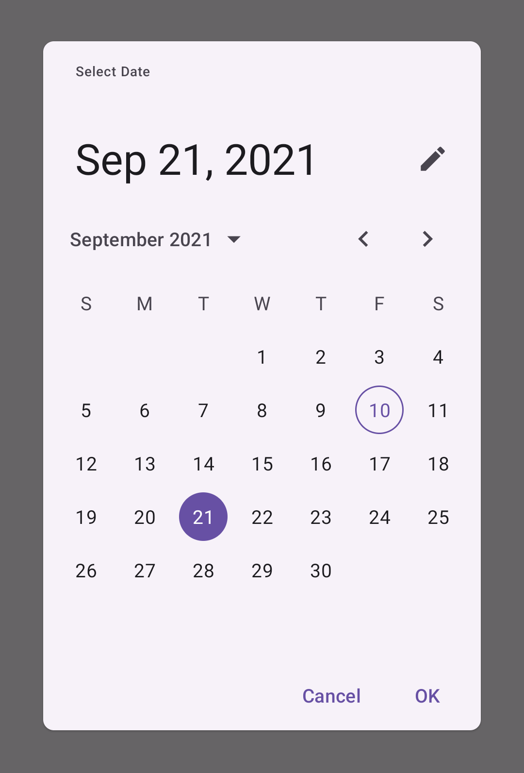
Date pickers let users select a date or range of dates.
Contents
Design and API Documentation
Using date pickers
Before you can use Material date pickers, you need to add a dependency to the Material Components for Android library. For more information, go to the Getting started page.
Date pickers let users select a date or range of dates. They should be suitable for the context in which they appear.
Date pickers can be embedded into dialogs on mobile devices.
Usage
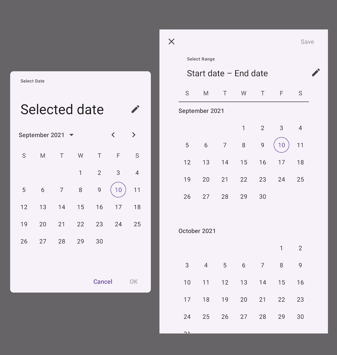
The following image shows a date picker and a range date picker.
API and source code:
MaterialDatePickerCalendarConstraints
A date picker can be instantiated with MaterialDatePicker.Builder.datePicker():
kt
val datePicker =
    MaterialDatePicker.Builder.datePicker()
        .setTitleText("Select date")
        .build()
A date range picker can be instantiated with MaterialDatePicker.Builder.dateRangePicker():
kt
val dateRangePicker =
    MaterialDatePicker.Builder.dateRangePicker()
        .setTitleText("Select dates")
        .build()
To set a default selection:
kt
// Opens the date picker with today's date selected.
MaterialDatePicker.Builder().datePicker()
      ...
    .setSelection(MaterialDatePicker.todayInUtcMilliseconds())

// Opens the date range picker with the range of the first day of
// the month to today selected.
MaterialDatePicker.Builder.dateRangePicker()
      ...
    .setSelection(
          Pair(
            MaterialDatePicker.thisMonthInUtcMilliseconds(),
            MaterialDatePicker.todayInUtcMilliseconds()
          )
        )
The picker can be started in text input mode with:
kt
MaterialDatePicker.Builder().datePicker()
      ...
    .setInputMode(MaterialDatePicker.INPUT_MODE_TEXT)
A DayViewDecorator can be set allowing customizing the day of month views within the picker (example of a DayViewDecorator):
kt
MaterialDatePicker.Builder().datePicker()
      ...
    .setDayViewDecorator(new CircleIndicatorDecorator())
To show the picker to the user:
kt
picker.show(supportFragmentManager, "tag");Subscribe to button clicks or dismiss events with the following calls:
kt
picker.addOnPositiveButtonClickListener {
    // Respond to positive button click.
}
picker.addOnNegativeButtonClickListener {
    // Respond to negative button click.
}
picker.addOnCancelListener {
    // Respond to cancel button click.
}
picker.addOnDismissListener {
    // Respond to dismiss events.
}
Finally, you can get the user selection with datePicker.selection.
Adding calendar constraints
To constrain the calendar from the beginning to the end of this year:
kt
val today = MaterialDatePicker.todayInUtcMilliseconds()
val calendar = Calendar.getInstance(TimeZone.getTimeZone("UTC"))

calendar.timeInMillis = today
calendar[Calendar.MONTH] = Calendar.JANUARY
val janThisYear = calendar.timeInMillis

calendar.timeInMillis = today
calendar[Calendar.MONTH] = Calendar.DECEMBER
val decThisYear = calendar.timeInMillis

// Build constraints.
val constraintsBuilder =
   CalendarConstraints.Builder()
       .setStart(janThisYear)
       .setEnd(decThisYear)
To open the picker at a default month:
kt
...
calendar[Calendar.MONTH] = Calendar.FEBRUARY
val february = calendar.timeInMillis

val constraintsBuilder =
   CalendarConstraints.Builder()
       .setOpenAt(february)
To set the first day of the week:
kt
val constraintsBuilder =
   CalendarConstraints.Builder()
       .setFirstDayOfWeek(Calendar.MONDAY)
To set a validator:
kt
// Makes only dates from today forward selectable.
val constraintsBuilder =
   CalendarConstraints.Builder()
       .setValidator(DateValidatorPointForward.now)

// Makes only dates from February forward selectable.
val constraintsBuilder =
   CalendarConstraints.Builder()
       .setValidator(DateValidatorPointForward.from(february))
You can also use DateValidatorPointBackward or customize by creating a class that implements DateValidator (example of a DateValidatorWeekdays in the MDC catalog).
Set the constraint to the picker's builder:
kt
MaterialDatePicker.Builder().datePicker()
      ...
    .setCalendarConstraints(constraintsBuilder.build())
Making date pickers accessible
Material date pickers are fully accessible and compatible with screen readers. The title of your date picker will be read when the user launches the dialog. Use a descriptive title for the task:
kt
val picker =
   MaterialDatePicker.Builder()
      ...
       .setTitleText("Select appointment date")
   ...
Calendar date picker
Calendar date pickers can be used to select dates in the near future or past, when it’s useful to see them in a calendar month format. They are displayed in a dialog.
Common use cases include:
- Making a restaurant reservation
- Scheduling a meeting
Date picker example
The following example shows a date picker with a date selected.
In code:
kt
val datePicker =
    MaterialDatePicker.Builder.datePicker()
        .setTitleText("Select date")
        .setSelection(MaterialDatePicker.todayInUtcMilliseconds())
        .build()

datePicker.show()
Date range pickers
Mobile date range pickers allow selection of a range of dates. They cover the entire screen.
Common use cases include:
- Booking a flight
- Reserving a hotel
Date range picker example
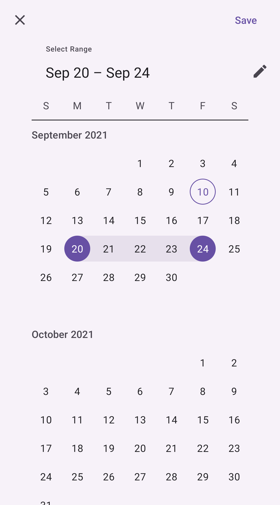
The following example shows a date range picker with a date range selected.
In code:
kt
val dateRangePicker =
    MaterialDatePicker.Builder.dateRangePicker()
        .setTitleText("Select dates")
        .setSelection(
          Pair(
            MaterialDatePicker.thisMonthInUtcMilliseconds(),
            MaterialDatePicker.todayInUtcMilliseconds()
          )
        )
        .build()

dateRangePicker.show()
Anatomy and key properties
The following diagram shows the elements of a date picker:
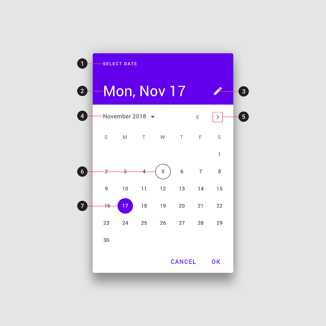
- Title
- Selected date
- Switch-to-keyboard input icon
- Year selection menu
- Month pagination
- Current date
- Selected date
Container
| Element | Attribute | Related method(s) | Default value |
|---|---|---|---|
| Color | app:backgroundTint | N/A | ?attr/colorSurfaceContainerHigh |
| Shape | app:shapeAppearance | N/A | ?attr/shapeAppearanceCornerExtraLarge |
Title
| Element | Attribute | Related method(s) | Default value |
|---|---|---|---|
| Style | app:materialCalendarHeaderTitle | N/A | @style/Widget.Material3.MaterialCalendar.HeaderTitle |
| Text label | N/A | Builder.setTitleTextgetHeaderText | Select Date |
| Color | android:textColor | N/A | ?attr/colorOnSurfaceVariant |
| Typography | android:textAppearance | N/A | ?attr/textAppearanceLabelMedium |
Selected date
| Element | Attribute | Related method(s) | Default value |
|---|---|---|---|
| Style | app:materialCalendarHeaderSelection | N/A | @style/Widget.Material3.MaterialCalendar.HeaderSelection |
| Color | android:textColor | N/A | ?attr/colorOnSurface |
| Typography | android:textAppearance | N/A | ?attr/textAppearanceHeadlineLarge |
Switch-to-keyboard input icon
| Element | Attribute | Related method(s) | Default value |
|---|---|---|---|
| Style | app:materialCalendarHeaderToggleButton | N/A | @style/Widget.Material3.MaterialCalendar.HeaderToggleButton |
| Background | android:background | N/A | ?attr/actionBarItemBackground |
| Color | android:tint | N/A | ?attr/colorOnSurfaceVariant |
Year selection menu
| Element | Attribute | Related method(s) | Default value |
|---|---|---|---|
| Style | app:materialCalendarYearNavigationButton | N/A | @style/Widget.Material3.MaterialCalendar.YearNavigationButton |
| Text color | android:textColor | N/A | ?attr/colorOnSurfaceVariant |
| Icon color | app:iconTint | N/A | ?attr/colorOnSurfaceVariant |
Month pagination
| Element | Attribute | Related method(s) | Default value |
|---|---|---|---|
| Style | app:materialCalendarMonthNavigationButton | N/A | @style/Widget.Material3.MaterialCalendar.MonthNavigationButton |
| Text color | android:textColor | N/A | ?attr/colorOnSurfaceVariant |
| Icon color | app:iconTint | N/A | ?attr/colorOnSurfaceVariant |
Current date
| Element | Attribute | Related method(s) | Default value |
|---|---|---|---|
| Style | app:dayTodayStyle | N/A | @style/Widget.Material3.MaterialCalendar.Day.Today |
| Text color | app:itemTextColor | N/A | ?attr/colorPrimary |
| Stroke color | app:itemStrokeColor | N/A | ?attr/colorPrimary |
| Stroke width | app:itemStrokeWidth | N/A | 1dp |
Selected date
| Element | Attribute | Related method(s) | Default value |
|---|---|---|---|
| Style | app:daySelectedStyle | N/A | @style/Widget.Material3.MaterialCalendar.Day.Selected |
| Background color | app:itemFillColor | N/A | ?attr/colorPrimary |
| Text color | app:itemTextColor | N/A | ?attr/colorOnPrimary |
| Stroke color | app:itemStrokeColor | N/A | N/A |
| Stroke width | app:itemStrokeWidth | N/A | 0dp |
Selected range
| Element | Attribute | Related method(s) | Default value |
|---|---|---|---|
| Color | app:rangeFillColor | N/A | ?attr/colorSurfaceVariant |
Cancel button
| Element | Attribute | Related method(s) | Default value |
|---|---|---|---|
| Style | app:materialCalendarHeaderCancelButton | N/A | @style/Widget.Material3.MaterialCalendar.HeaderCancelButton |
| Text color | android:textColor | N/A | ?attr/colorOnSurface (see all states) |
| Icon color | app:iconTint | N/A | ?attr/colorOnSurfaceVariant |
Styles and theme overlays
| Element | Style |
|---|---|
| Default theme overlay | ThemeOverlay.Material3.MaterialCalendar |
| Default style | Widget.Material3.MaterialCalendar |
| Fullscreen theme overlay | ThemeOverlay.Material3.MaterialCalendar.Fullscreen |
| Full screen style | Widget.Material3.MaterialCalendar.Fullscreen |
Default style theme attribute (set inside the theme overlay): ?attr/materialCalendarStyle
Default theme attribute (set on the app's theme): ?attr/materialCalendarTheme, ?attr/materialCalendarFullscreenTheme (fullscreen)
See the full list of styles, attributes, and theme overlays.
Theming date pickers
Date pickers support Material Theming which can customize color, shape and typography.
Date picker theming example
API and source code:
MaterialDatePickerCalendarConstraints
The following example shows a date picker with Material Theming.
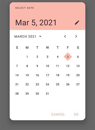
Use theme attributes and styles in res/values/styles.xml, which apply to all date pickers and affect other components:
xml
<style name="Theme.App" parent="Theme.Material3.*">
    ...
    <item name="colorPrimary">@color/shrine_pink_100</item>
    <item name="colorOnPrimary">@color/shrine_pink_900</item>
    <item name="shapeAppearanceSmallComponent">@style/ShapeAppearance.App.SmallComponent</item>
    <item name="shapeAppearanceMediumComponent">@style/ShapeAppearance.App.MediumComponent</item>
</style>

<style name="ShapeAppearance.App.SmallComponent" parent="ShapeAppearance.Material3.SmallComponent">
    <item name="cornerFamily">cut</item>
</style>

<style name="ShapeAppearance.App.MediumComponent" parent="ShapeAppearance.Material3.MediumComponent">
    <item name="cornerSize">16dp</item>
</style>
Use a default style theme attribute, styles and a theme overlay which apply to all date pickers but do not affect other components:
xml
<style name="Theme.App" parent="Theme.Material3.*">
    ...
    <item name="materialCalendarTheme">@style/ThemeOverlay.App.DatePicker</item>
</style>

<style name="ThemeOverlay.App.DatePicker" parent="@style/ThemeOverlay.Material3.MaterialCalendar">
    <item name="colorPrimary">@color/shrine_pink_100</item>
    <item name="colorOnPrimary">@color/shrine_pink_900</item>
    <item name="shapeAppearanceSmallComponent">@style/ShapeAppearance.App.SmallComponent</item>
    <item name="shapeAppearanceMediumComponent">@style/ShapeAppearance.App.MediumComponent</item>
    <!-- Customize text field of the text input mode. -->
    <item name="textInputStyle">@style/Widget.App.TextInputLayout</item>
  </style>
Set the theme in code, which affects only this date picker:
kt
val picker =
   MaterialDatePicker.Builder()
      ...
       .setTheme(.style.ThemeOverlay_App_DatePicker)