Appearance
Slider
Sliders allow users to make selections from a range of values.
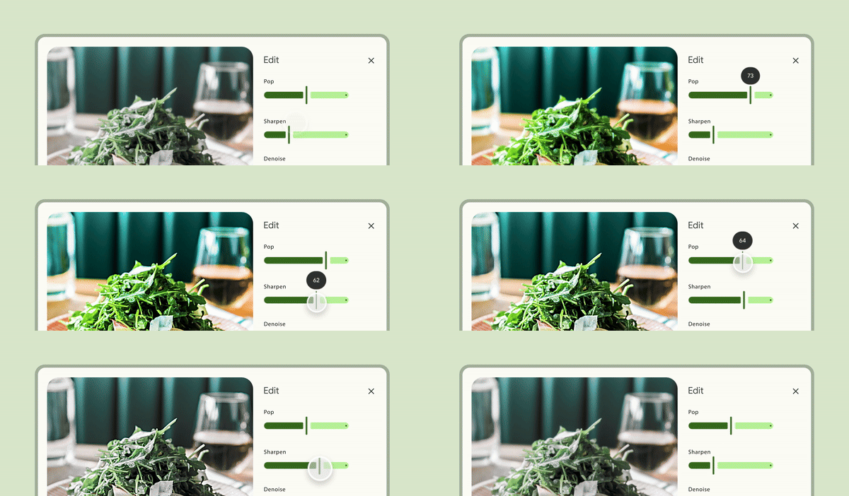
Contents
Design and API Documentation
Using sliders
Before you can use Material sliders, you need to add a dependency to the Material Components for Android library. For more information, go to the Getting started page.
Usage
Add a Slider to a layout:
xml
<!-- Continuous slider -->
<com.google.android.material.slider.Slider
    ...
    android:valueFrom="0.0"
    android:valueTo="100.0"  />

<!-- Discrete slider -->
<com.google.android.material.slider.Slider
    ...
    android:valueFrom="0.0"
    android:valueTo="100.0"
    android:stepSize="10.0"  />
Observe changes to a slider:
kt
slider.addOnSliderTouchListener(object : Slider.OnSliderTouchListener {
    override fun onStartTrackingTouch(slider: Slider) {
        // Responds to when slider's touch event is being started
    }

    override fun onStopTrackingTouch(slider: Slider) {
        // Responds to when slider's touch event is being stopped
    }
})

slider.addOnChangeListener { slider, value, fromUser ->
    // Responds to when slider's value is changed
}
API and source code:
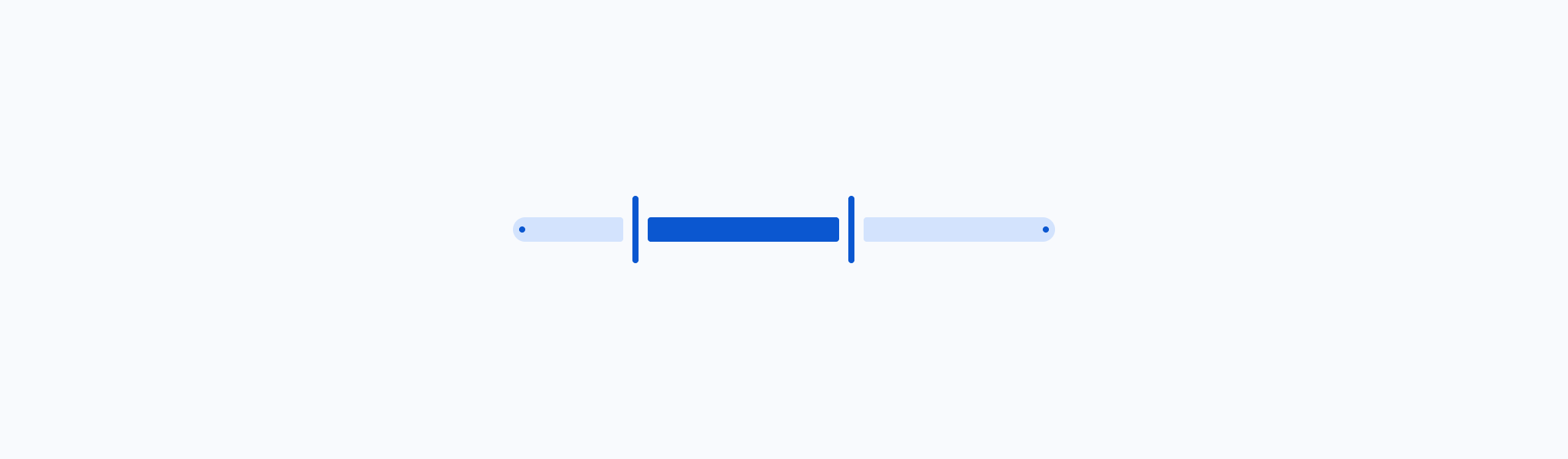
A slider with two thumbs is called a range slider. Add a RangeSlider to a layout:
xml
<!-- Continuous slider -->
<com.google.android.material.slider.RangeSlider
    ...
    android:valueFrom="0.0"
    android:valueTo="100.0"
    app:values="@array/initial_slider_values"  />

<!-- Discrete slider -->
<com.google.android.material.slider.RangeSlider
    ...
    android:valueFrom="0.0"
    android:valueTo="100.0"
    app:values="@array/initial_slider_values"
    android:stepSize="10.0"  />
And in values/arrays.xml:
xml
<resources>
  <array name="initial_slider_values">
    <item>20.0</item>
    <item>70.0</item>
  </array>
</resources>
Observe changes to a range slider:
kt
rangeSlider.addOnSliderTouchListener(object : RangeSlider.OnSliderTouchListener {
    override fun onStartTrackingTouch(slider: RangeSlider) {
        // Responds to when slider's touch event is being started
    }

    override fun onStopTrackingTouch(slider: RangeSlider) {
        // Responds to when slider's touch event is being stopped
    }
})

rangeSlider.addOnChangeListener { rangeSlider, value, fromUser ->
    // Responds to when slider's value is changed
}
API and source code:
RangeSlider
Making sliders accessible
Sliders support setting content descriptors for use with screen readers. While optional, we strongly encourage their use.
That can be done in XML via the android:contentDescription attribute or programmatically:
kt
slider.contentDescription = contentDescriptionIf using a TextView to display the value of the slider, you should set android:labelFor so that screen readers announce that TextView refers to the slider.
The minimum touch target size of the thumb is 48dp by default. If a different size is needed, please set minTouchTargetSize in the style or the layout.
Adding/removing the value label
By default, the slider will show a value label above the thumb when it's selected. You can change how it's drawn via the app:labelBehavior attribute or setLabelBehavior method.
The modes of app:labelBehavior are:
floating(default) - draws the label floating above the bounds of this viewwithinBounds- draws the label floating within the bounds of this viewgone- prevents the label from being drawnvisible- always draws the label
Note: there's a known issue where the label doesn't scroll along with the screen when the slider is in a scrollable container and app:labelBehavior=visible. To work around that you should either use a different mode or hide the label on scroll.
Setting a LabelFormatter
By using a LabelFormatter you can display the selected value using letters to indicate magnitude (e.g.: 1.5K, 3M, 12B). That can be achieved through the setLabelFormatter method.
The following example shows a slider for a price range in USD currency.
In code:
kt
rangeSlider.setLabelFormatter { value: Float ->
    val format = NumberFormat.getCurrencyInstance()
    format.maximumFractionDigits = 0
    format.currency = Currency.getInstance("USD")
    format.format(value.toDouble())
}
Types
There are two types of sliders: 1. Continuous slider, 2. Discrete slider
Continuous slider
Continuous sliders allow users to make meaningful selections that don’t require a specific value.
The following example shows a continuous slider.
In the layout:
xml
<com.google.android.material.slider.Slider
    android:id="@+id/slider"
    android:layout_width="match_parent"
    android:layout_height="wrap_content"
    android:contentDescription="@string/slider_desc"
    android:value="20.0"
    android:valueFrom="0.0"
    android:valueTo="100.0" />
Continuous range slider
The following example shows a continuous range slider.
In the layout:
xml
<com.google.android.material.slider.RangeSlider
  android:id="@+id/range_slider"
  android:layout_width="match_parent"
  android:layout_height="wrap_content"
  android:contentDescription="@string/slider_desc"
  app:values="@array/initial_slider_values"
  android:valueFrom="0.0"
  android:valueTo="100.0" />
Discrete slider
Discrete sliders display a numeric value label upon pressing the thumb, which allows a user to input an exact value.
The following example shows a discrete slider.
In the layout:
xml
<com.google.android.material.slider.Slider
    ...
    android:stepSize="10.0" />
Discrete range slider
The following example shows a discrete range slider.
In the layout:
xml
<com.google.android.material.slider.RangeSlider
    ...
    android:stepSize="10.0"  />
Anatomy and key properties
A slider has a track, one or two thumbs, and an optional value label. A discrete slider also has tick marks.
- Value label (optional)
- Active track stop indicator
- Active track
- Thumb
- Inactive track
- Inactive track stop indicator
Track attributes
| Element | Attribute | Related method(s) | Default value |
|---|---|---|---|
| Min value | android:valueFrom | setValueFromgetValueFrom | N/A |
| Max value | android:valueTo | setValueTogetValueTo | N/A |
| Step size (discrete) | android:stepSize | setStepSizegetStepSize | N/A |
| Initial selected value (Slider) | android:value | setValuegetValue | N/A |
| Initial selected values (RangeSlider) | app:values | setValuesgetValues | N/A |
| Height | app:trackHeight | setTrackHeightgetTrackHeight | 16dp |
| Color | app:trackColor | setTrackTintListgetTrackTintList | null |
| Color for track's active part | app:trackColorActive | setTrackActiveTintListgetTrackActiveTintList | ?attr/colorPrimary |
| Color for track's inactive part | app:trackColorInactive | setTrackInactiveTintListgetTrackInactiveTintList | ?attr/colorSurfaceContainerHighest |
| Inside corner size | app:trackInsideCornerSize | setTrackInsideCornerSizegetTrackInsideCornerSize | 2dp |
| Stop indicator size | app:trackStopIndicatorSize | setTrackStopIndicatorSizegetTrackStopIndicatorSize | 4dp |
| Minimum separation for adjacent thumbs | app:minSeparation | setMinSeparationgetMinSeparation | 0dp |
Note: app:trackColor takes precedence over app:trackColorActive and app:trackColorInative. It's a shorthand for setting both values to the same thing.
Note: app:trackStopIndicatorSize takes precedence over app:tickRadiusActive and app:tickRadiusInactive.
Thumb attributes
| Element | Attribute | Related method(s) | Default value |
|---|---|---|---|
| Color | app:thumbColor | setThumbTintListgetThumbTintList | ?attr/colorPrimary |
| Width | app:thumbWidth | setThumbWidthsetThumbWidthResourcegetThumbWidth | 4dp |
| Height | app:thumbHeight | setThumbHeightsetThumbHeightResourcegetThumbHeight | 44dp |
| Radius | app:thumbRadius | setThumbRadiusResourcesetThumbRadiusgetThumbRadius | N/A |
| Elevation | app:thumbElevation | setThumbElevationResourcesetThumbElevationgetThumbElevation | 2dp |
| Halo color | app:haloColor | setHaloTintListgetHaloTintList | @android:color/transparent |
| Halo radius | app:haloRadius | setHaloRadiusResourcesetHaloRadiusgetHaloRadius | N/A |
| Stroke color | app:thumbStrokeColor | setThumbStrokeColorsetThumbStrokeColorResourcegetThumbStrokeColor | null |
| Stroke width | app:thumbStrokeWidth | setThumbStrokeWidthsetThumbStrokeWidthResourcegetThumbStrokeWidth | 0dp |
| Gap size | app:thumbTrackGapSize | setThumbTrackGapSizegetThumbTrackGapSize | 6dp |
Note: app:thumbWidth and app:thumbHeight take precedence over app:thumbRadius.
Value label attributes
| Element | Attribute | Related method(s) | Default value |
|---|---|---|---|
| Style | app:labelStyle | N/A | @style/Widget.Material3.Tooltip |
| Formatter | N/A | setLabelFormatterhasLabelFormatter | null |
| Behavior | app:labelBehavior | setLabelBehaviorgetLabelBehavior | floating |
Note: The value label is a Tooltip.
Tick mark attributes
| Element | Attribute | Related method(s) | Default value |
|---|---|---|---|
| Color | app:tickColor | setTickTintListgetTickTintList | null |
| Color for tick's active part | app:tickColorActive | setTickActiveTintListgetTickActiveTintList | ?attr/colorSurfaceContainerHighest |
| Color for tick's inactive part | app:tickColorInactive | setTickInactiveTintListgetTickInactiveTintList | ?attr/colorPrimary |
| Radius for tick's active part | app:tickRadiusActive | setTickActiveRadiusgetTickActiveRadius | null (1/2 trackStopIndicatorSize) |
| Radius for tick's inactive part | app:tickRadiusInactive | setTickInactiveRadiusgetTickInactiveRadius | null (1/2 trackStopIndicatorSize) |
| Tick visible | app:tickVisible | setTickVisibleisTickVisible() | true |
Note: app:tickColor takes precedence over app:tickColorActive and app:tickColorInative. It's a shorthand for setting both values to the same thing.
Styles
| Element | Style |
|---|---|
| Default style | Widget.Material3.Slider |
Default style theme attribute: ?attr/sliderStyle
See the full list of styles and attributes.
Non-Text Contrast update
In order to comply with the latest accessibility requirements, the Slider has been updated with additional attributes:
app:thumbTrackGapSize: size of the gap between the thumb and the track, 6dp by default.app:trackInsideCornerSize: size of the corners towards the thumb when a gap is present, 2dp by default.app:trackStopIndicatorSize: size of the stop at the start/end of the track, 4dp by default.
*.Legacy styles have been added to revert to the previous behavior (not recommended):
Widget.Material3.Slider.Legacy
Theming sliders
Sliders support Material Theming which can customize color and typography.
Slider theming example
API and source code:
SliderRangeSlider
The following example shows a range slider with Material Theming.
Implementing slider theming
Use theme attributes and styles in res/values/styles.xml which applies to all sliders and affects other components:
xml
<style name="Theme.App" parent="Theme.Material3.*">
    ...
    <item name="colorPrimary">@color/shrine_pink_100</item>
    <item name="colorOnPrimary">@color/shrine_pink_900</item>
    <item name="colorOnSurface">@color/shrine_pink_100</item>
</style>
Use a default style theme attribute, styles and a theme overlay which applies to all sliders but does not affect other components:
xml
<style name="Theme.App" parent="Theme.Material3.*">
    ...
    <item name="sliderStyle">@style/Widget.App.Slider</item>
</style>

<style name="Widget.App.Slider" parent="Widget.Material3.Slider.Legacy">
    <item name="materialThemeOverlay">@style/ThemeOverlay.App.Slider</item>
    <item name="labelStyle">@style/Widget.App.Tooltip</item>
  </style>

<style name="ThemeOverlay.App.Slider" parent="">
    <item name="colorPrimary">@color/shrine_pink_100</item>
    <item name="colorOnPrimary">@color/shrine_pink_900</item>
    <item name="colorOnSurface">@color/shrine_pink_100</item>
</style>

<style name="Widget.App.Tooltip" parent="Widget.Material3.Tooltip">
    <item name="android:textAppearance">@style/TextAppearance.App.Tooltip</item>
    <item name="backgroundTint">@color/shrine_pink_900</item>
  </style>

<style name="TextAppearance.App.Tooltip" parent="TextAppearance.Material3.BodySmall">
  <item name="android:textColor">@color/shrine_pink_100</item>
  <item name="fontFamily">@font/rubik</item>
  <item name="android:fontFamily">@font/rubik</item>
</style>
Use the style in the layout, which affects only this specific slider:
xml
<com.google.android.material.slider.RangeSlider
    ...
    style="@style/Widget.App.Slider"  />